When building a website, we need to keep in mind our future visitor’s navigation experience in it. I’ve seen owners and designers who want to design their website or client’s website how they believe it will be effective or how they like it aesthetically. As a marketer, I always avoid assuming consumer behavior or any other marketing aspect. The best way to do this is by looking for information based on “best practices…” on any marketing execution. In my last post, I discussed what makes a website successful is measured by the performance of traffic generated, conversions driven, and revenue generated. The question is, how will you make people take action on your website when you can’t control their behavior?

Many of the colleagues I had in the past will always use that as an excuse. They thought digital marketing campaigns would not drive revenue and would only be used for brand awareness. I started feeling like that until I noticed some agencies on their website mentioned that they had generated millions of dollars by running digital campaigns. I was amazed that that was possible, and that’s how I got into programmatic media. As a programmatic trader, I do many optimizations to ensure that my campaigns drive conversions toward revenue. A well-designed and healthy website needs to be done to make this happen. To check the website’s performance in terms of how quickly the pages load, are the Java scripts are well placed, and whether the images affect the page loading, you can use Page Insights. This tool allows you to run a quick scan of a website, and it will provide you with feedback based on performance, accessibility, best practices, and SEO, along with a score per area between 1 being bad and 100 being perfect.

As I said, besides running a performance-driven campaign and having a healthy website, your design needs to guide or lead your visitors to convert. While researching, I found a video explaining the 7 Principles of a Conversion-Centered Design. This video explains how to design a website focused on triggering conversions. The seven principles are:
- Attention
- Context
- Clarity
- Congruence
- Credibility
- Closing
- Continuance
In this post, I want to focus on the first principle: attention. Attention is one of the most essential principles since this will be focused on your conversion goal. For example, if you are running a campaign for a client such as a hotel, the landing page should have one thing that should be brought to the users to lead them to an action. To make this happen, distractions can lead the users to take other actions that are not your goal. In other words, on that landing page, you should not offer another decision other than the action you are looking for them to make or not to make the action. It’s like a yes or no type of concept or approach.
Examples:
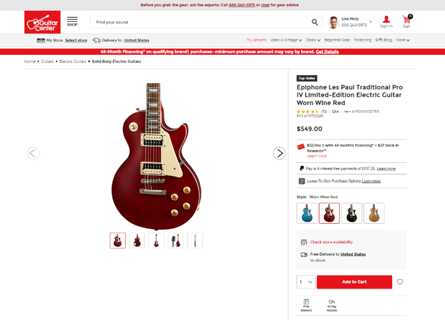
Example A:

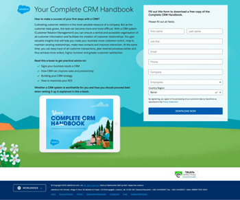
Example B:

If you see the image referred to as Example A, that is Guitar Center’s landing page from their campaign. They are retargeting me since I wanted to buy a new guitar on their website. If you look at the image closely, you will notice that you can take more than one option before purchasing a guitar. I can see all the colors, I can search for other products, go back to the home page, or even navigate around the website to browse and not even fill out a form. Clearly, they are sending people down the funnel, but are the people taking the action that Guitar Center wants? This is a great analysis they can do to understand the behavior of their users on the website.
For Example B, you can see how straightforward the landing page is. They have information explaining how to take your first step to using a CRM. They provide you with that and the content of the handbook they are trying to offer. If you look at the landing page, there are only two actions that users can do. Either they fill out the form to download the handbook, or they don’t. That’s what I meant when I said you should not offer another option other than the action you want them to take.

Within “attention” there are 23 principles that will guide you in developing the best practices for the website’s visual hierarchy. Visual hierarchy is an excellent way of selling to someone without telling them visually that something is more important.
Some of the principles are:
- Proximity
- Anomaly
- Dominance
- Consistency
- Continuation
- Direction
To understand and apply these concepts, I encourage you to watch the video I mentioned to understand how to design a conversion-centered website.
It is essential to understand that the first 30 seconds of a user on a landing page are the most important. Usually, you have 30 seconds to captivate the user and/or make the user make an action on your landing page or website. After that time, they normally leave the website or get distracted with other information, products, pages, or any element the site contains. The information in this post and the video will help you avoid distractions when sending users down the marketing funnel by guiding their actions toward conversions that can be revenue, leads, calls, and more.
As a final tip, always remember to NSAMCWADLP


Leave a Reply